Eurovision Latinoamérica
Expanding one of the world's most celebrated events


Project Description
Voxovation are the producers of the international music phenomenon that is the Eurovision song contest. They initially approached AE Studio to build a voting app for the first in a series of events designed to extend the contest to the rest of the world: Eurovision Latinoamérica. In the initial consultations with their executives, it was revealed that the visual identity for the event itself had not yet been created. When I suggested that would be a blocker for us to develop the look and feel of the application, the response I got was: "That makes sense. Why don't we have you build that too?" And just like that, the audience of the project went from tens of thousands to tens of millions...no pressure or anything.
YEAR
2024
ROLE
Visual Design Director
EXPERTISE
Event Identity Design Experience Design
Deliverables
Event Identity, Style Guide & Graphic Asset Library End-to-End UX, Visual, and Interactive Design for Event Application
First Impression
Onboarding and Voting User Flow
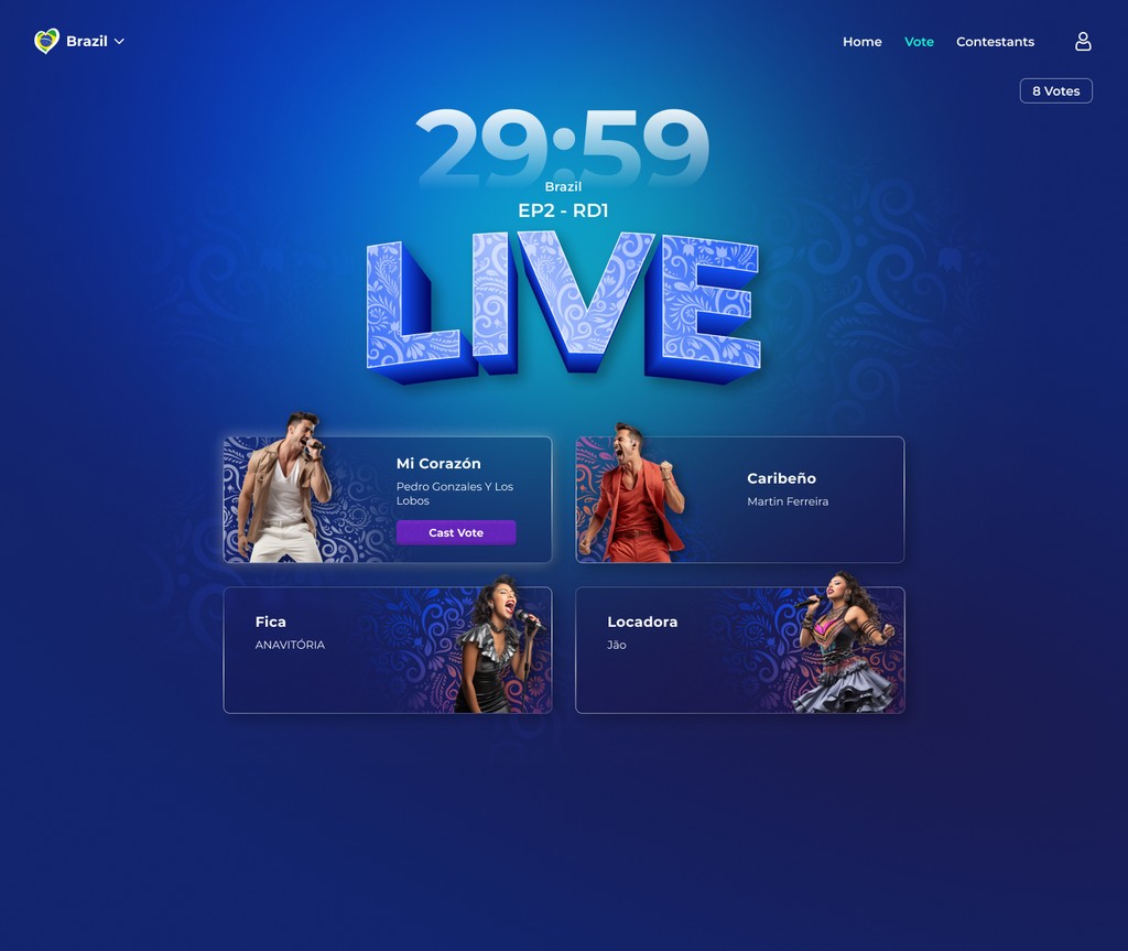
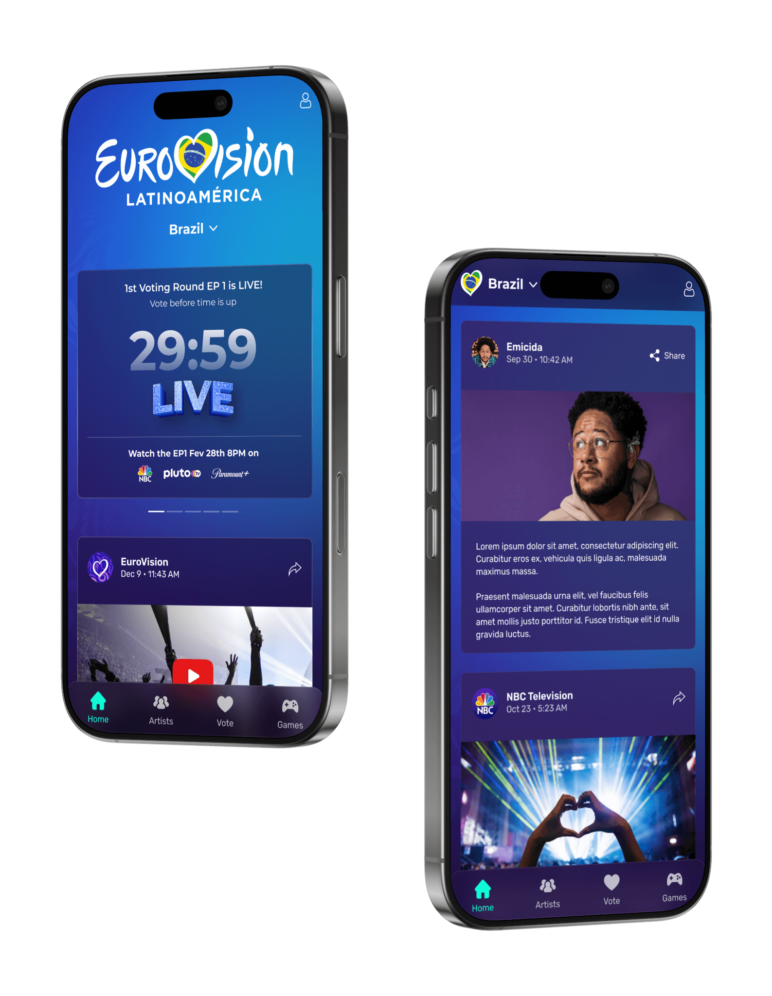
We knew that the live event would be the primary driver to app downloads, specifically as users were prompted to vote for their favorite contestants. As such, the onboarding screen had to funnel directly into the voting flow. Moreover, that voting experience would play a huge part in whether or not a user returned to the app. With this in mind, we aimed to infuse the experience with a sense of drama and fanfare that mirrored the event itself.
Event Identity Development
Conceptual Themes
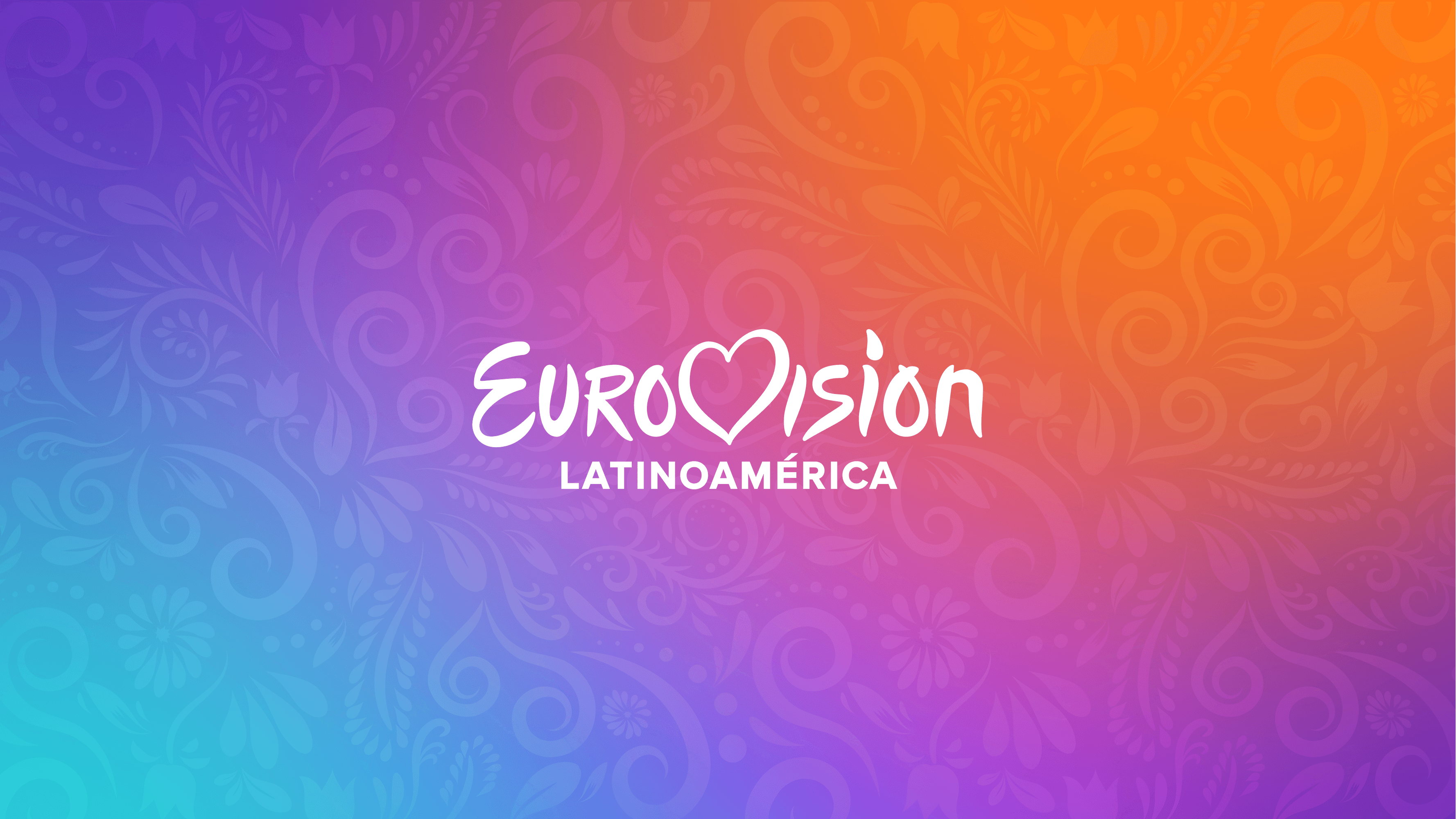
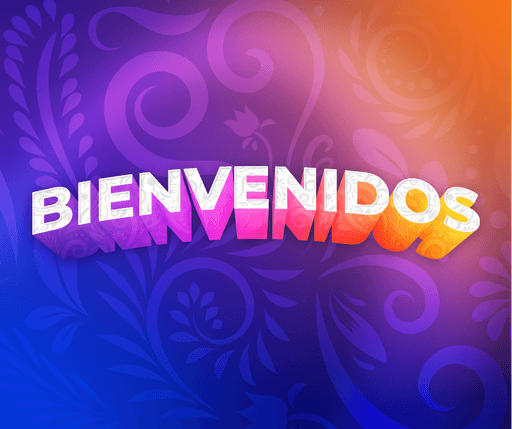
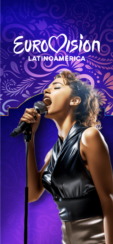
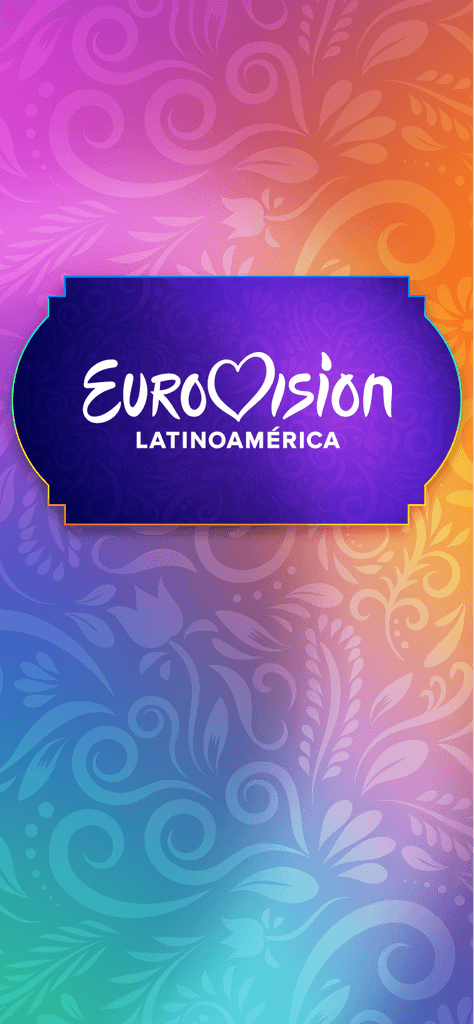
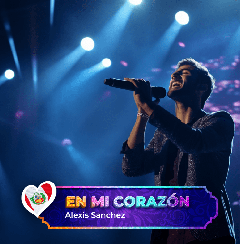
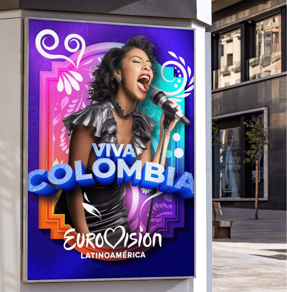
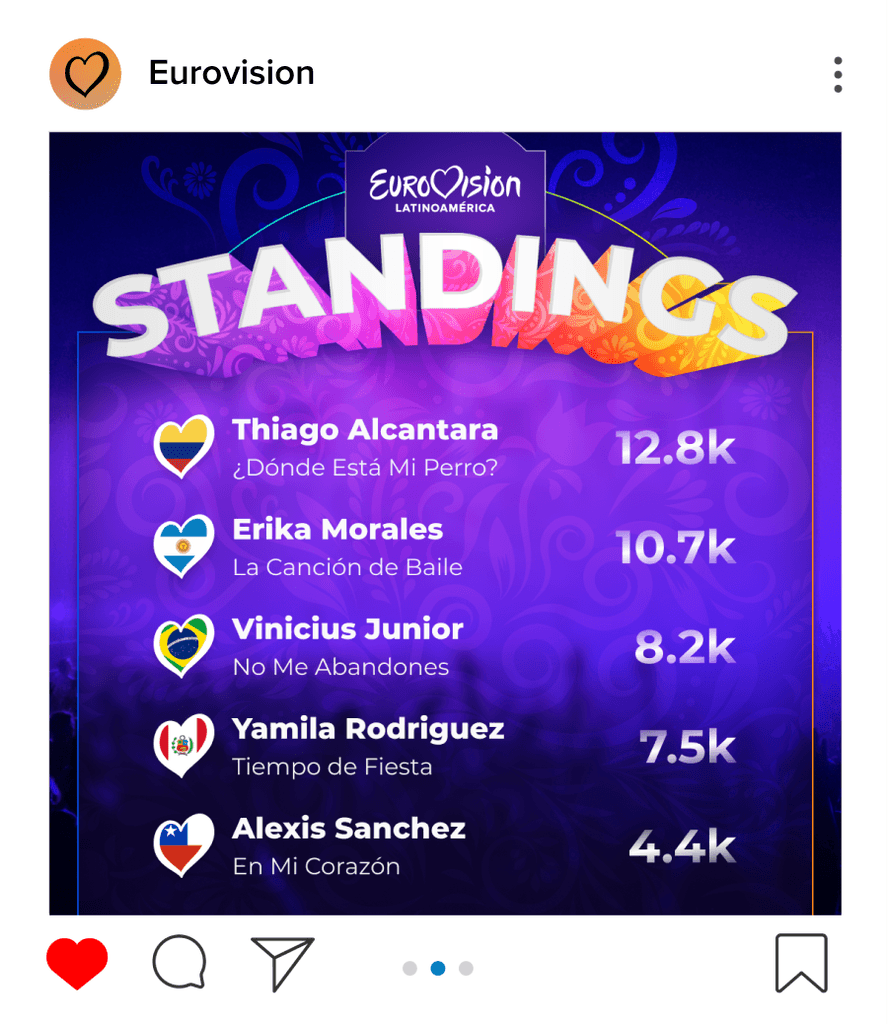
The primary challenge of creating the event identity was crafting the existing Eurovision brand elements into a new visual container that felt inclusive to the Latin American audience. I started with a celebration of the iconic Eurovision heart logo—abstracting it into a "spotlight" to emphasize content. I then drew inspiration from Latin American art and culture: a floral texture that referenced the heart logo; a content container that emulated traditional Latin American wooden frames; and a graphic approach to typography that borrowed from the traditional hand-painted signage of the region.











Event Identity Design
Visual Storytelling Across Media Touchpoints
Event Identity Design
Visual Storytelling Across Media Touchpoints
Event Identity Design
Visual Storytelling Across Media Touchpoints







UX & Visual Design
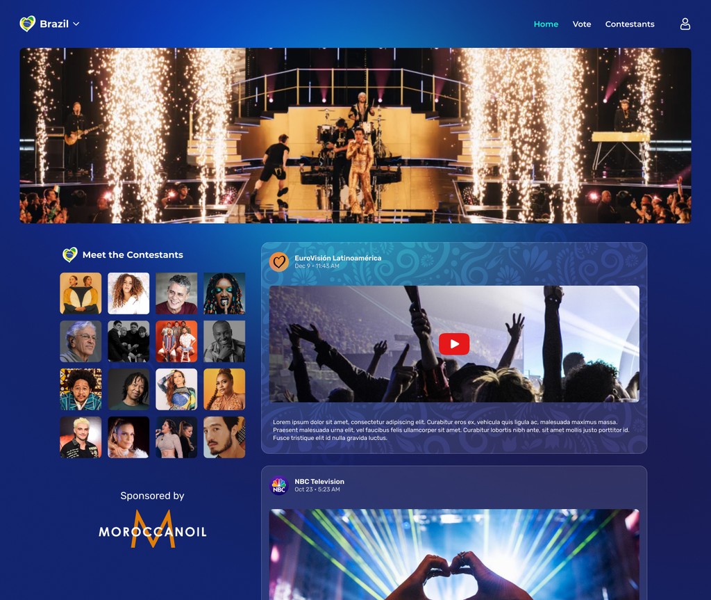
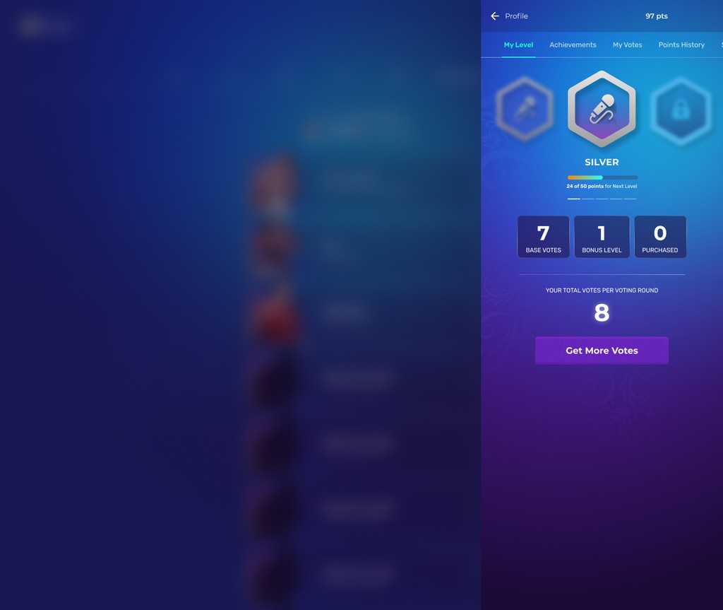
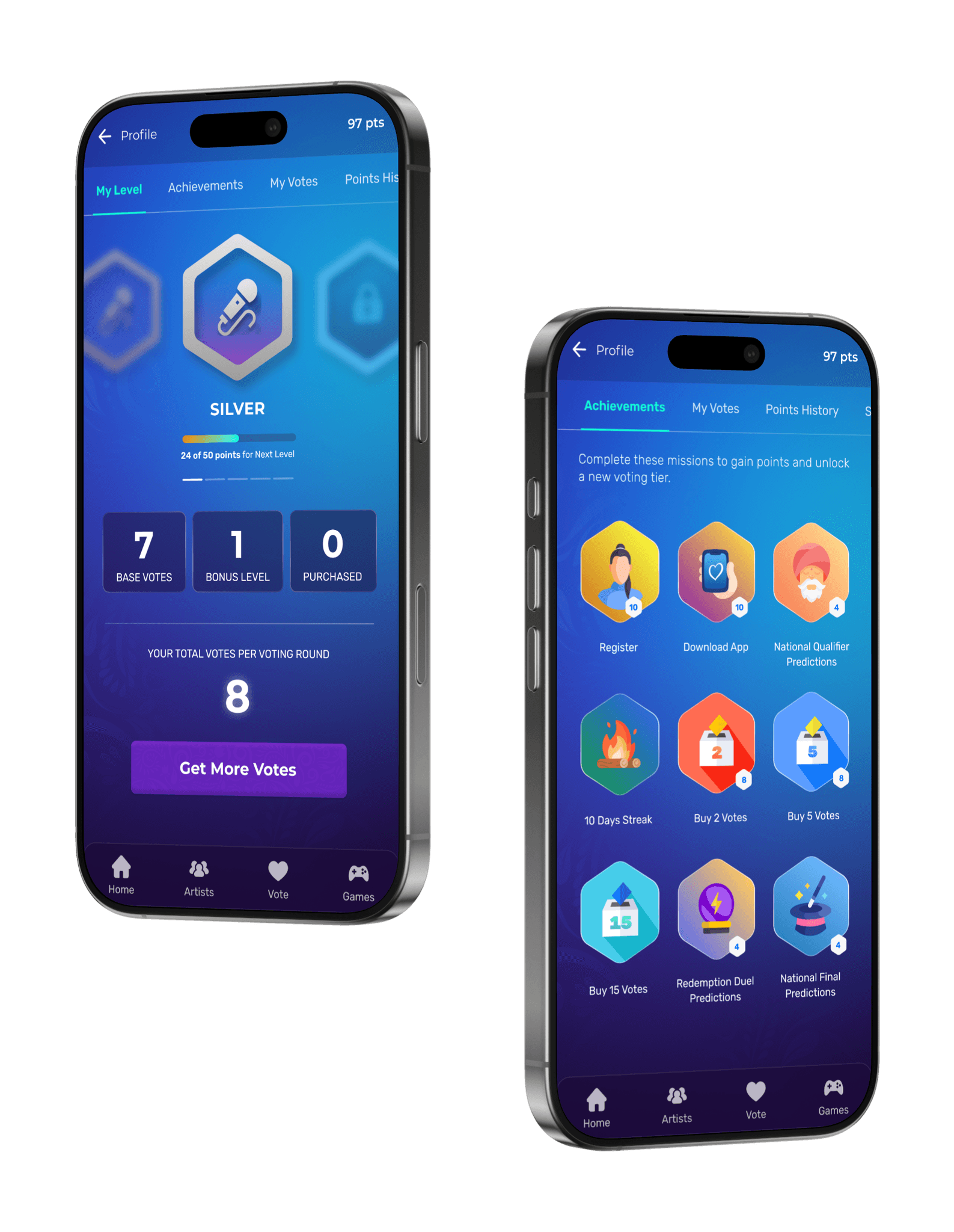
News Feed & User Achievements
UX & Visual Design
News Feed & User Achievements
UX & Visual Design
News Feed & User Achievements




UX & Visual Design
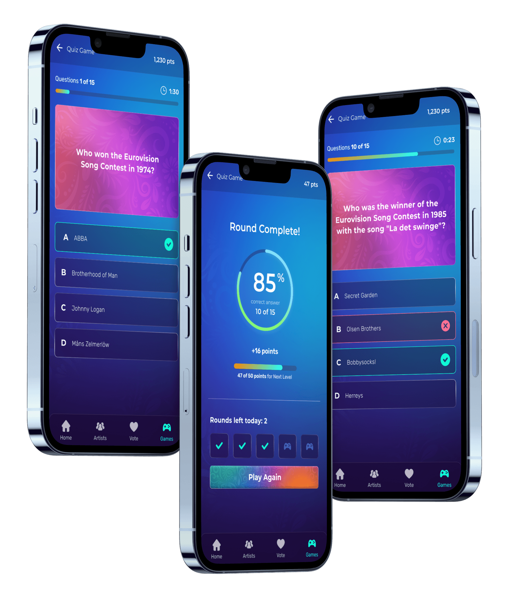
Eurovision Trivia Game
UX & Visual Design
Eurovision Trivia Game
UX & Visual Design
Eurovision Trivia Game


UX & Visual Design
Desktop Experience
UX & Visual Design
Desktop Experience
UX & Visual Design
Desktop Experience
